10. Timeline
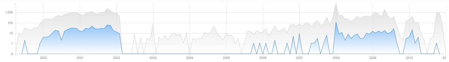
The Timeline shows how a set of search results is spread over time. This tells the user when certain communications or other activities took place.
Another important use case of this visualization is to find anomalies in the data. Any gaps in the chart may indicate shortcomings in the data collection process, e.g. due to a device or disk that should have been included. However, it can also indicate custodians intentionally or unintentionally withholding data, e.g. by deleting emails prior to the collection.
The date range that Intella Connect looks for ranges from 1990 to the current year plus two years. This will filter out bogus dates that are far in the past or future.
Large, real-life data sets will often show items on specific dates like January 1st, 1970, January 1st, 1980 or similar “round” dates.
These are typically caused by default date values used in some applications.
The range can be adjusted by adding or changing following two properties inside [CASE]/prefs/case.prefs properties file:
- TimelineStartFilter - specifies the start year of the timeline range.
- TimelineEndFilter - specifies the end year of the timeline range.
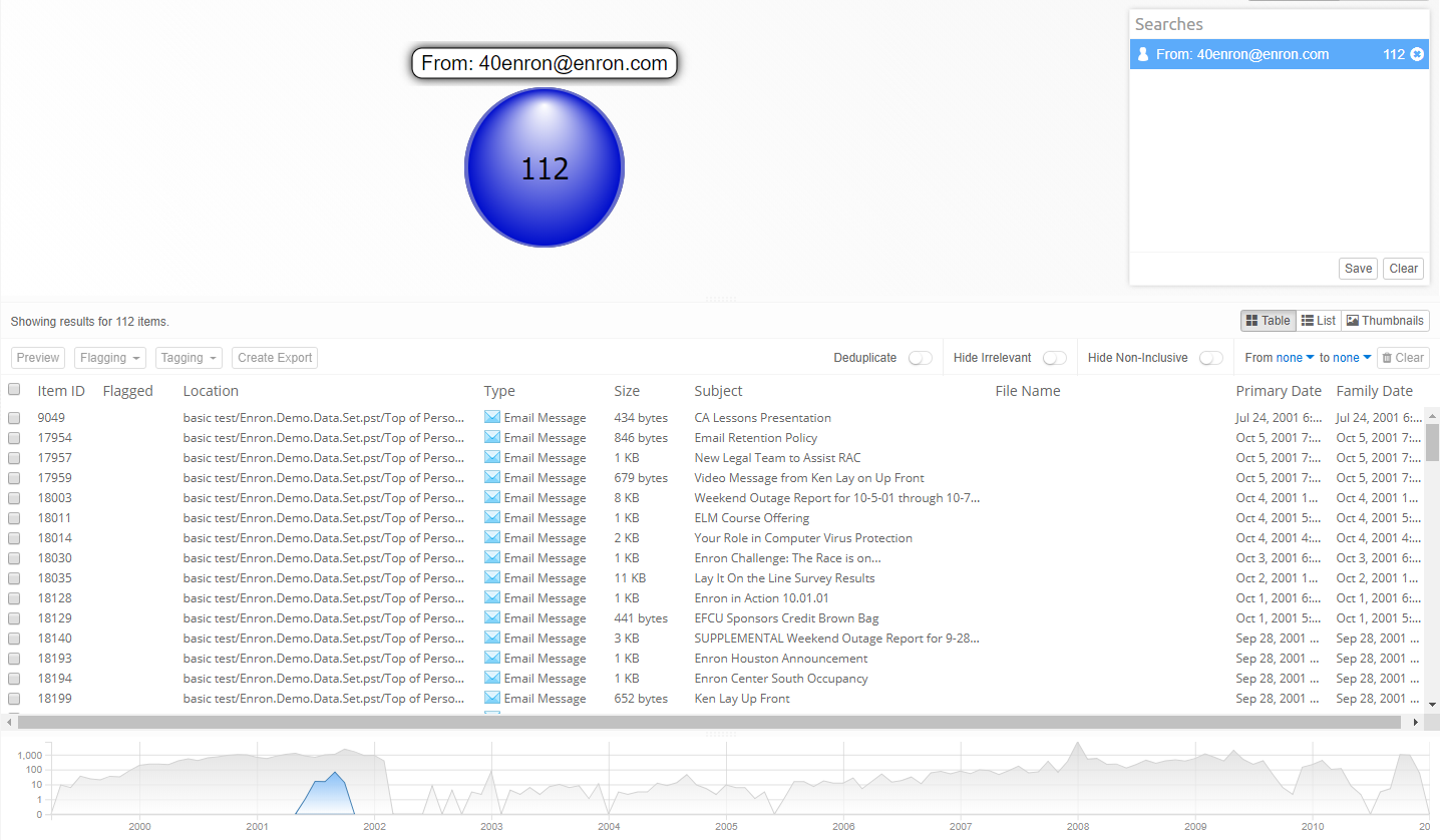
The X axis shows time and Y axis shows amount of items in given month in logarithmic scale. The gray graph line represents all items and blue graph line represents items of selected query from searches list, cluster from cluster map or from geolocation map.
For example, selecting query for all emails from an email address will show these emails in time as the blue graph line.
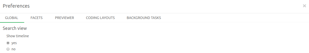
Timeline can be hidden in the Preferences window. Hiding timeline will let the details table take it’s space and show more rows.
10.1. Date attributes
The date attribute used to create the chart is the Family Date. This typically gives a good sense of the “when” of an evidence set, without dates in older email attachments and files giving a warped sense of the relevant dates.
10.2. Selections
The Timeline can filter items shown in details panel. To see items in a range of years or months, drag the mouse cursor across the chart. This will show a marker in the background, indicating the selected date range.
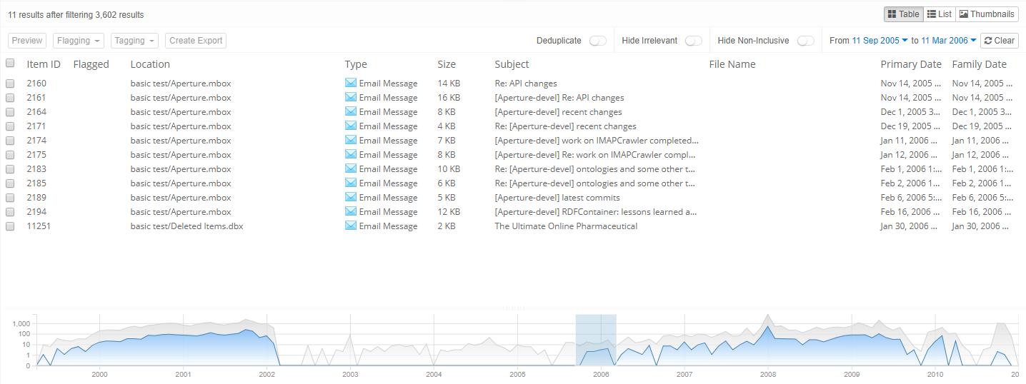
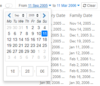
Additionally, the selected date range in timeline graph is shown above details table in textual form. Clicking on date shown next to “From” and “to” will show calendar on which the date and time can be specified precisely. Changing the date and time in calendars will update the selection in timeline graph.
10.3. Limitations
Current granularity of timeline is that for each month, amount of items is displayed on 1st day of the month, i.e. each point on timeline shows amount of items for given month. Having only few items within a month or spread across few months would show such disparity, because of low and static granularity as opposed to having larger amount of items spread across months and years. Future versions may make it possible to have higher granularity, e.g. weeks, days, hours or dynamic granularity, e.g. division into 50 time intervals of equal duration.